- Role
- Contract Product Designer
- Skills
- SaaS Dashboard Design, Design Strategy
- Tools
- Figma
- Timeline
- June - October 2024
- Status
- Shipped
Personalized dashboards for students navigating community college

Overview
TecoGuide is Inspirame’s platform that helps students navigate the community college system in the quickest and cheapest way possible, given many of the students are from underserved backgrounds facing systemic barriers to higher education.
The dashboard is the first thing students seem but it did not offer a lot of personal or actionable information off the bat, so students had few reasons to explore beyond it.
I redesigned the dashboard for three user groups: high school students, college students, and industry trainees. This case study shows how the project evolved from a layout problem to an overarching conversation about what a dashboard for this population should measure in the first place.
The Constraint
I worked with Inspirame’s existing design system and component library, so I leveraged information architecture, content strategy, and interaction patterns instead of relying solely on visual styling.
The dashboard was also supposed to serve three user groups with different goals, and everything had to stay above the fold.
The Problem
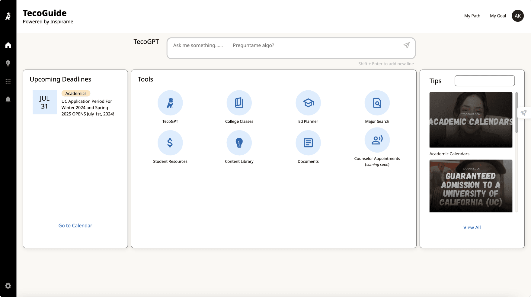
Students landed on the dashboard and had no clear next steps to take
The existing dashboard presented generic content in the same order to every user group, with no sense of progress, no clear next steps, and no personalization to where they were in their education journey.
The recurring feedback I heard in user testing sessions was to be able to see personalized updates on the platform.
My instinct to track performance, and why it was wrong for this context
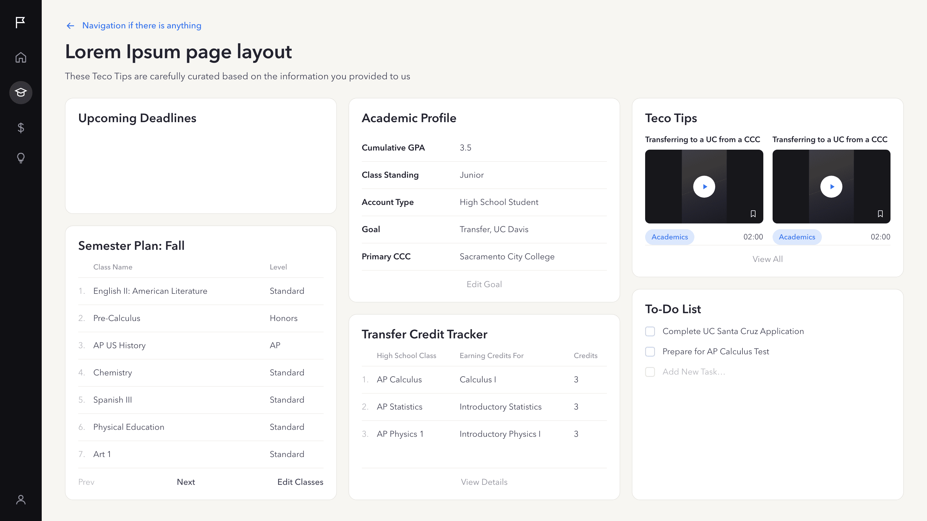
My first iterations did what most student dashboards do: display GPA, transfer credits, and academic standing front and center. Initially, it seemed like the most direct way to show students their progress.
In a review with Inspirame’s co-founder, it became clear to me that a history of low grades due to a systemic lack of education support is part of the barrier for many TecoGuide students. Spotlighting academic performance metrics risked demotivation by showing a struggling student exactly what they already fear, the moment they logged in. This would cast the wrong first impression on the student for a platform whose mission is to inspire.
The Insight
The dashboard should motivate students through what they can do next, rather than measuring them by what they’ve already done.
Key Designs
How the insights shaped the final dashboard
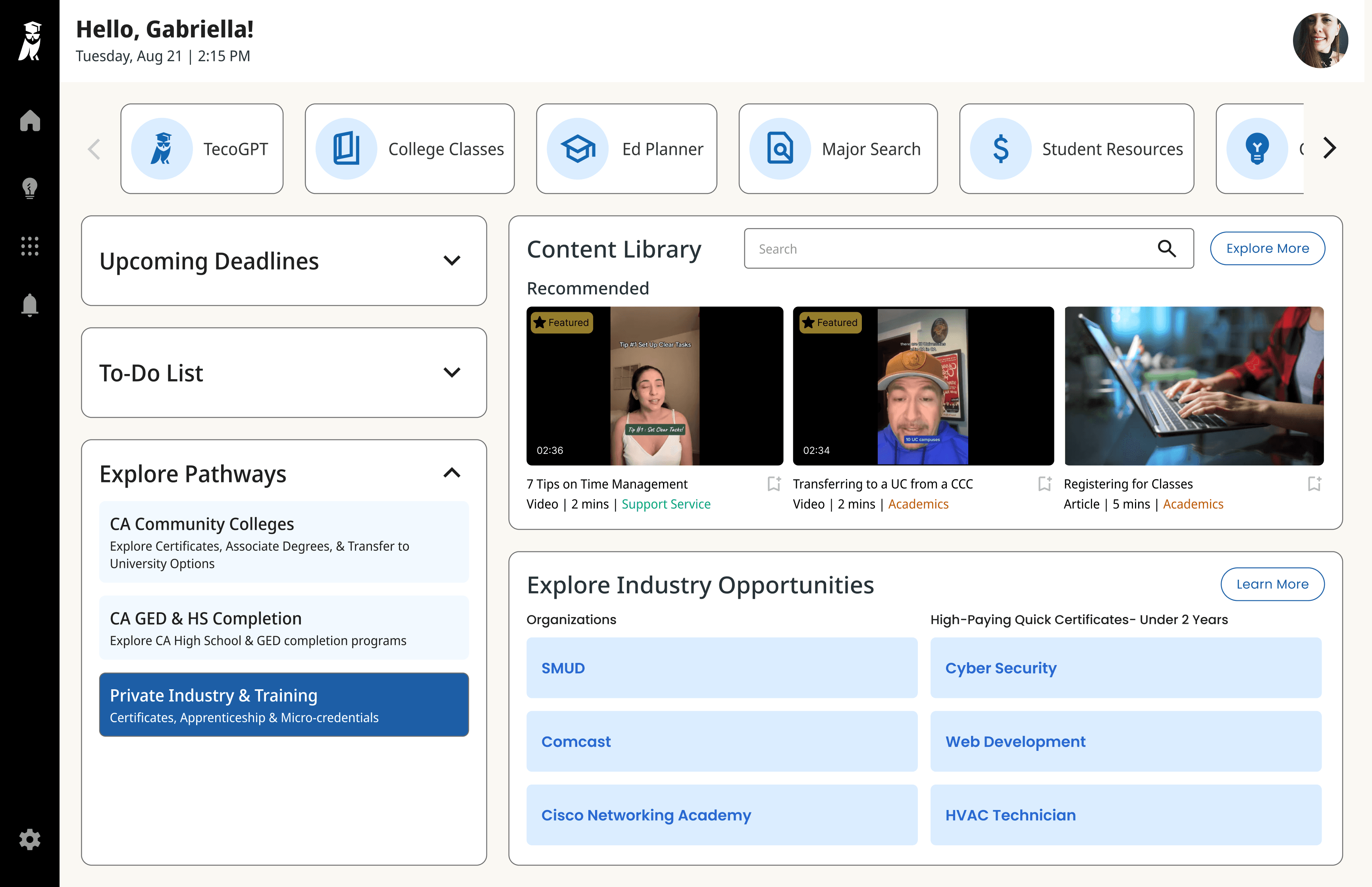
Leading with next steps instead of scores
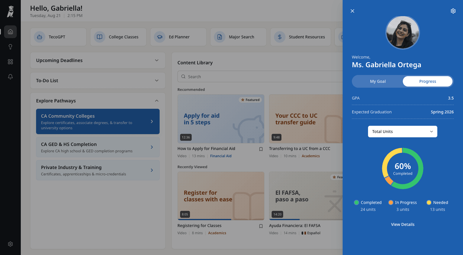
The left column of widgets is built around what students can act upon.
- Upcoming Deadlines surfaces relevant time-sensitive dates like registration windows, program application deadlines, etc.
- The To-Do list populates automatically from those deadlines, but students can also add and edit items, turning the widget into a dynamic planning tool instead of a static list.
- Explore Pathways routes students to resources based on the path they want to take, whether that’s community college, GED and high school completion, or industry training.
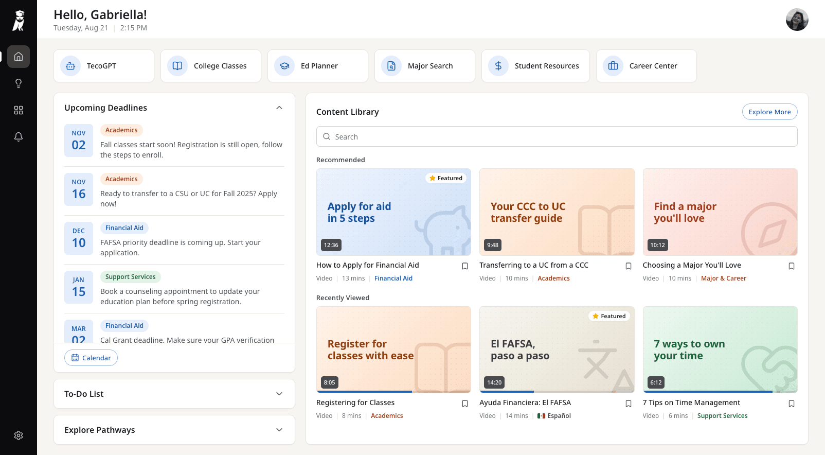
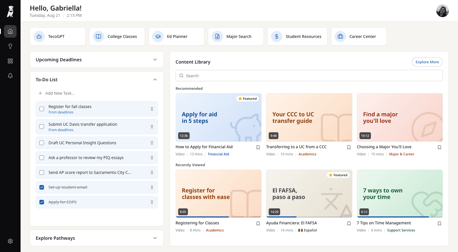
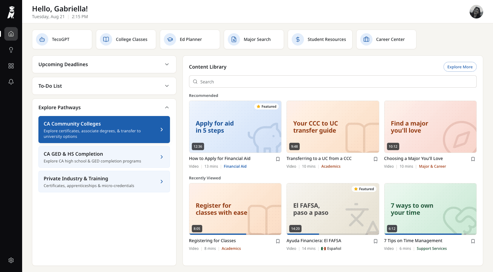
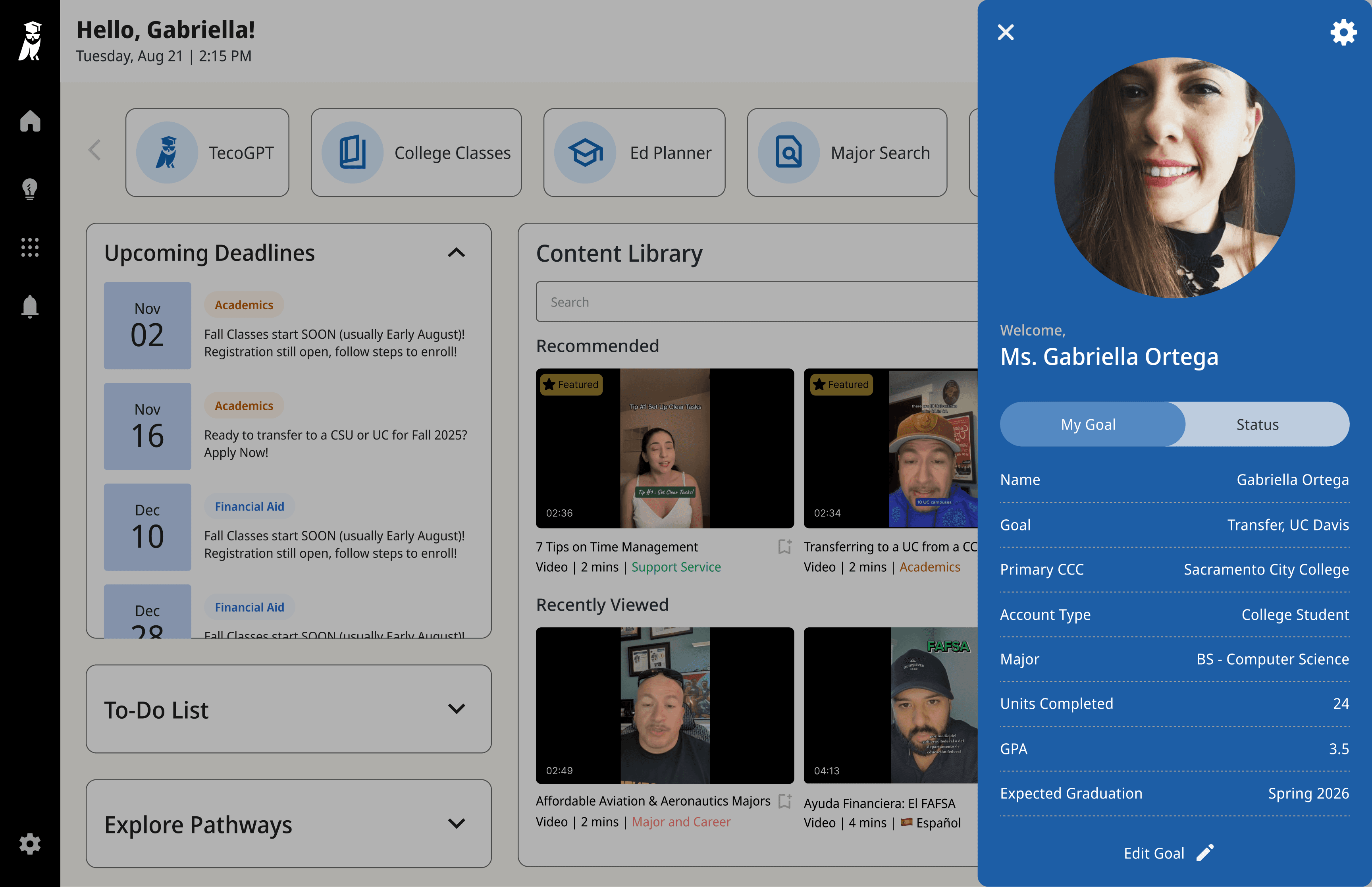
I moved academic metrics into a profile panel students can open from their avatar at the top right, so they can see performance metrics when they want to, not the moment they log into the platform. I adapted the panel from a profile component my teammate designed for the parent-facing dashboard.
- It opens on My Goal, which shows information about where the student is headed, before their standing.
- The Status tab frames progress as a path towards their goal. It shows units that are completed, in progress, and still needed, so users see the actionable distance they have to go.
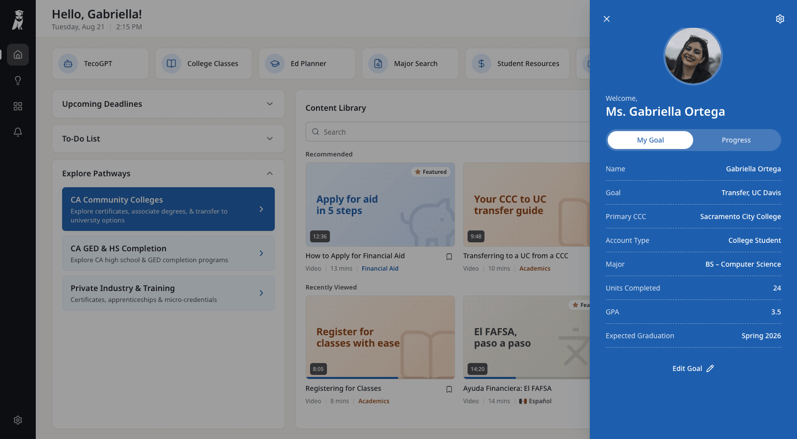
Different dashboards for different user goals
Academic dashboards are centered around education milestones like deadlines, pathways, and content about transferring and enrolling. Students can still explore industry training as one pathway among several.
Industry training dashboards put career opportunities at the center of the dashboard. For trainees, a Featured Roles widget shows opportunities they can apply for directly from the dashboard, with navigation available for the dedicated Featured Roles and Role Search pages.
Everything stays within reach above the fold
I was designing with the constraint that the dashboard needs to remain above the fold. With several widgets competing for limited space, I made them collapsible, with only one expandable at a time. Students can open what they need one widget at a time instead of facing all the action-based widgets at once.