- Role
- Product Lead, Design Engineer
- Skills
- Product Design, UX, UI, Frontend Implementation
- Tools
- Claude Code (with Opus 5)
- Timeline
- August 2026 (2 weeks)
- Status
- Shipped, Aug 2026
Data-connected report builder for university funds
Overview
Two weeks to land two pilot SMIFs, with a report editor built in code
At student-managed investment funds (SMIFs), analysts pitch investment ideas through written proposals or reports that make the case for a position before the fund’s investment committee decides on it. But the work behind each report is scattered: analysts research in one tool, build charts in another, and write in a third. With two university funds set to onboard in two weeks, I designed and build QuantLink’s report editor directly in code.
With QuantLink Reports, analysts can write proposals with integrated platform data, using a library of components, page layouts, and branded templates, or create their own. The beta shipped in two weeks and helped secure two additional funds from a big university as clients.
The Ask
Analyst workflows are scattered across tools. How can we help?
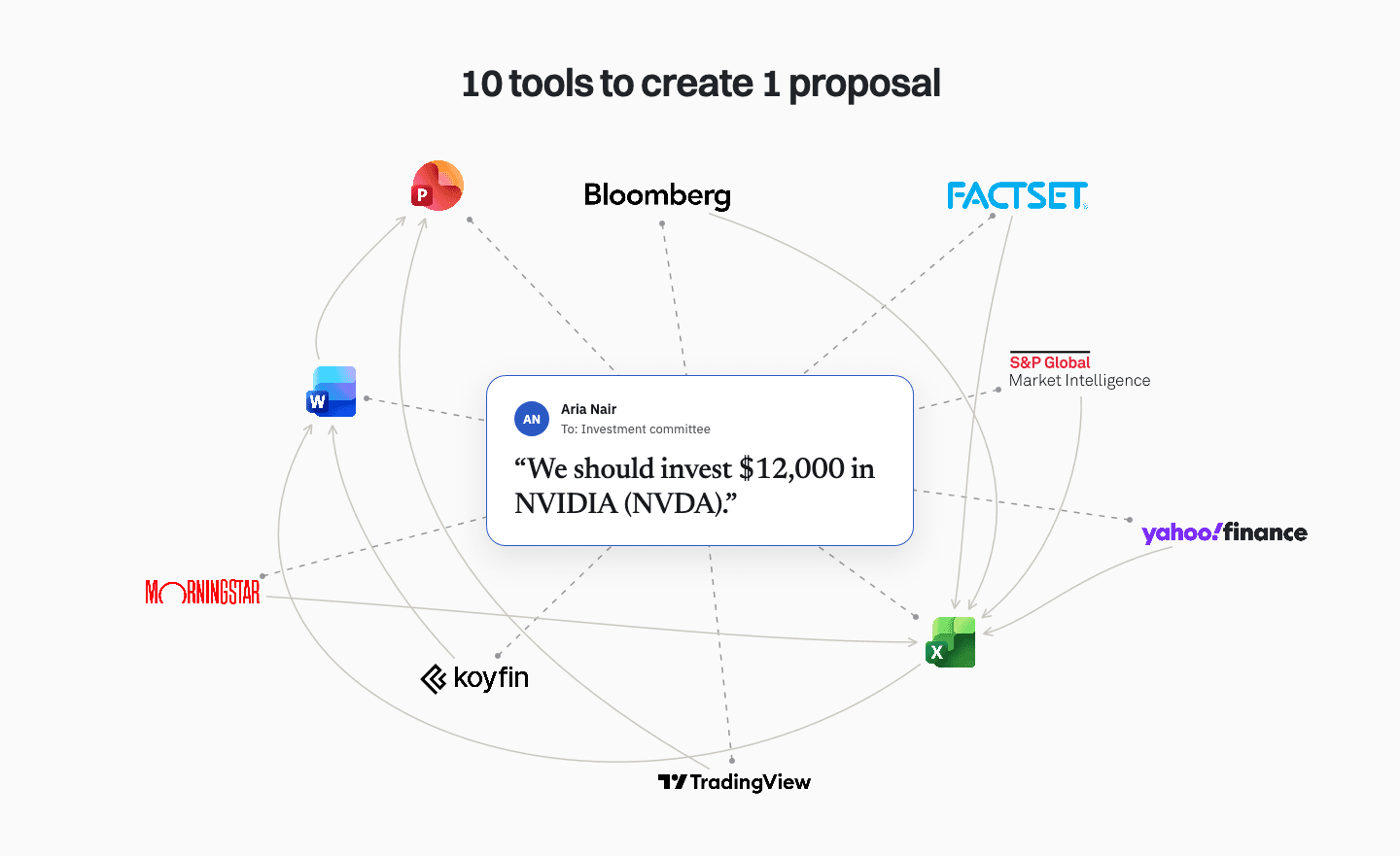
After having demo calls with 6 SMIFs (Student-Managed Investment Funds) at universities across the US, there was one pain point that kept coming up: analysts’ current workflows are very segmented across different tools. They gather their data from one platform, consolidate in another, build charts and model portfolios in another, and create investment proposal reports and stock pitch decks in another. This segmentation leads to issues like stale data and inconsistent formatting across analysts.
I recognized a unique opportunity to consolidate their workflows within our platform. The team and I discussed the possibility of giving users a productivity suite consisting of a document builder and a deck builder within our platform, connected with our data and the other features in the platform, and all the SMIFs we discussed this with were very enthusiastic about it.
I prioritized building out the report builder first and the deck builder was scoped out for later. Engineering a deck builder is a lot more structurally complex than reports, given a big part of it is that users can freely place elements anywhere on a slide and a big part of a successful deck builder is the smoothness. I decided to start with reports, using it to engineer the logic of elements that would apply to decks as well, like components, layouts, and templates.
The Constraint
We had 2 weeks until the SMIFs’ onboarding, so I designed directly in code
We were scheduled to host onboarding calls with 2 university SMIFs in 2 weeks, where we were going to onboard them onto the platform. I wanted to have a beta version of Reports up for the onboarding meetings, which created a tight deadline.
The most efficient way to design this was directly in code, since a lot of the feature’s fundamental UX, like cursor behavior, pagination, drag-and-drop, and live data embeds, would be best tested and configured when they’re live and able to be used.
The building phase was split into 2 weeks. Week 1 went to putting together an MVP focused on getting all the fundamental features and functionality live. Week 2 was spent on advanced functionality like custom report template creation and report theming, but scope had to give: theme editing for user-created templates turned out to be a harder design problem than the week allowed, so it was deferred.
The Core Architecture
The classic text editor interface layered with modern and advanced editing features
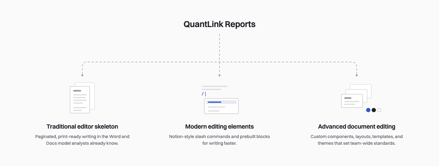
The Reports feature was going to consist of three layers:
- Traditional word editor skeleton: Ultimately, the fundamental purpose of the feature is for analysts to build text-heavy reports that end up as PDFs or printed documents. Traditional word editors like MS Word and Google Docs are built for detailed text editing. Additionally, given these are the tools analysts currently use to write reports, they’re already familiar with that surface and mental model.
- Modern word editor elements: The idea was to adopt certain design elements from tools like Notion, like the slash (/) menu and prebuilt components like columns, callouts, checklists, table of contents, breadcrumbs etc. to make analyst workflows more efficient.
- Advanced document editing: Letting users create custom components, page layouts, and report templates, or add from our library, along with the ability to change a report template’s theme, is how we would differentiate ourselves from other text editors (in addition to the data integration aspect, of course). These features would save users time – analysts would much rather be able to switch a report theme in seconds, instead of manually restyling a 20-page report. These features would let funds easily set team-wide standards that persist and scale over time.
Key Designs
Key design decisions that shaped the feature
Paginated documents + block-based editing
-
One of the most fundamental ways I combined traditional and modern document editors was keeping documents paginated while making block-based editing the underlying structure.
-
Pagination kept the output true to what analysts ultimately need: reports that export cleanly to PDF and print as expected.
-
Blocks changed how the document is built. Every paragraph, chart, KPI row, and callout is its own unit that can be inserted, moved, duplicated, or restyled on its own.
-
The rest of the Reports feature is built on top of this structure. Because content already lives in discrete blocks, a custom component is just a group of blocks saved for reuse, a page layout is a collection of components, and a template is a full report of blocks, components, and page layouts.
Every block type is also one keystroke away, so analysts can just press / to insert components as they write, without leaving the keyboard for a toolbar.
Data embeds are blocks too, so charts, KPIs, etc. sit in the document as native elements rather than pasted-in screenshots.
Because styling is attached to blocks and block types rather than individual text selections, a theme can restyle every heading, chart, or callout in a report at once, helping funds keep formatting consistent no matter how many analysts contribute to it.
Data integrations
- Everywhere else on the platform, charts and KPIs update live. In Reports, I made them point-in-time. A report is a record of the numbers an analyst builds their argument on. If those numbers keep updating, the report’s reasoning would drift away from the evidence.
- I proposed a feature where users could refresh all the data in a report in order to revise it without having to build another report all the way from scratch. This feature is on the roadmap, but was scoped out to remain focused on the 2-week deadline.
Components and page layouts
- Since everything in a report is a block, I designed components and page layouts as one system with two tiers. Our library gives every analyst and fund a baseline: we provide basic building blocks like tables, columns, and callouts, and finance-specific ones like KPI rows, charts, and decision bands.
- With custom component and page layout creation, analysts can create and save their own components and page layouts and edit them, so a fund only has to build templated recurring structures like a valuation summary component or a proposal report cover page once.
- The next addition to this I plan on building out is shared components across a team, which amplifies the systemization of a fund’s report creation workflow. I scoped it out for later because it will require setting up live editing and version history, which are design problems of their own.
Report templates and theming
- Analysts can add report templates from our library and change their theme so it can go from looking like a QuantLink report to their fund’s branded report with just a few configurations. They can edit brand colors (primary, secondary, primary tint, page background), add their own logos, edit the header and footer, and add a watermark with initials or a logo.
- Since a fund’s branding doesn’t change across reports, a theme can be saved as a preset and applied to any other library template with one click.
- Theming for user-created templates was deferred. Library templates come with color roles already assigned, so changing a theme is done by just swapping values. A custom template has no roles until the user assigns them, which meant designing a clear way to allow users to assign roles, which is a design problem that deserved more time than we could offer with the 2-week deadline at hand. Since pilot funds would start from library templates, theming those covered what they needed at launch.
Scoping the MVP
What pilot funds needed on day one, and what could wait
| Deferred | The decision behind it |
|---|---|
| Deck builder | Free-form content editing on slides makes it far more complex to build. Reports came first to establish the shared logic with components, layouts, and templates. |
| Refreshing report data | Point-in-time data already protects the accuracy of reports created by analysts. Refreshing the data is a revision convenience, not a launch need (as was affirmed by the pilot funds). |
| Shared team components | Requires live editing and version history, which are design problems that were not in scope to solve within the 2-week sprint. |
| Theming for custom templates | This requires a way for analysts to assign color roles, which was another design problem scoped for later. Library theming already covered pilot funds’ theming needs. |
What surfaced while building
Designing directly in code helped answer a lot of pivotal questions that a static mockup would’ve hidden
Designing Reports from 0 → 1 directly in code meant its hardest questions surfaced while I was designing rather than after the handoff. Each answer shaped the design in the moment.
Theming was a logic problem first, UX problem second
Building the theme editor raised a lot of core logic questions. Which elements of a report should each color role affect? What should respond to a theme edit, and what should stay fixed? How should a logo adapt across different header and footer layouts? The UX could only take shape once I settled the logic underneath.
Answering these for library templates also showed why custom templates’ theming was a different problem altogether: a color role means nothing until someone assigns it. Discovering this mid-build let me scope it out deliberately.
Hidden behavior complexity of combining pagination and blocks
Blocks treat each component as a single unit, while pagination breaks content wherever a page ends. The two models collide at the page boundary, and working with them live helped me swiftly find the right rule. Components made of separable parts, like two lines of text and an image, split at the boundary and continue on the next page. Components that are ‘whole’, like charts, move to the next page intact, since a chart split across two pages can’t be read.
Micro-interactions have to be felt to be tuned
The first version of the block highlight felt abrupt and clunky, which would be impossible to judge from a static frame. Adjusting it live, I settled on a quick fade-in on selection and fade-out on deselection.
Reports became the groundwork for Decks
Because components, layouts, and templates were built as working logic rather than specs, they carried straight over to the deck builder. When I started working on Decks, I was starting from an established system instead of a blank page.
Outcome
The beta shipped on time, impressed our clients, and helped close two more funds
- Reports played a key role in securing 2 SMIFs from Georgetown University as clients.
- Shipped a working beta of Reports in 2 weeks, in time for onboarding calls for 2 university SMIFs.
- During onboarding, analysts were excited to have a beta already in hand that tackled their biggest pain point: research, analysis, and presentation finally living in one platform.
- Check-in calls are scheduled for next month to gather qualitative feedback on what’s working, what’s missing, and what analysts want next. In the meantime, we are in regular contact with them to fix bugs and usability issues as they come up.
Reflections
Designing in code at startup speed made me a better designer
Designing in code changed how I work
Working directly in code meant I was able to resolve roadblocks, scope decisions, and granular interaction details as I worked instead of after handoff. It made me a faster and more decisive designer; every scoping call was grounded in what it would actually cost to build a feature, not a guess.
Speed came at a cost
Being the sole product designer juggling other deliverables, the two-week timeline meant pilot funds are testing a narrower version of Reports than I envisioned. The scoped out features, especially shared components and custom template theming, are what enable funds to set team-wide standards, which is a big part of the feature’s moat. This is the first thing I look forward to validating once these features are shipped.
A focused beta > a complete version delivered late
Funds were excited to have something real to use on short notice, and it solved the pain point they shared with us. Bringing on clients with a working product and improving it alongside them has built momentum and trust that a more polished feature months later couldn’t have.